Getting Started
1. Validate installation
After following the installation instructions, mATLASplotlib should be available at the python prompt
>>> import mATLASplotlib
The user interface of mATLASplotlib is centered on a canvas on which datasets can be plotted.
2. Constructing some data
To demonstrate how plotting works, we need some data: let’s construct some using ROOT and numpy
import numpy as np
import ROOT
hist = ROOT.TH1F("Generated data", "This is some autogenerated data", 40, -4, 4)
for x in np.random.normal(size=10000):
    hist.Fill(x)
this should have drawn 10000 samples from a normal distribution and added them to a ROOT histogram.
3. Setting up a canvas
We use a context manager to open the canvas, which ensures that necessary cleanup is done when the canvas is no longer needed.
Currently the supported canvases are the Simple canvas which contains one set of matplotlib axes,
the Ratio canvas, which contains a main plot and a ratio plot underneath,
and the the Panelled canvas which contains a top panel and an arbitrary number of lower panels beneath it.
import mATLASplotlib
with mATLASplotlib.canvases.Simple(shape="square") as canvas:
    canvas.plot_dataset(hist, style="scatter", label="Generated data", colour="black")
The three shapes preferred by the ATLAS style guide are “square” (600 x 600 pixels), “landscape” (600 x 800 pixels) and “portrait” (800 x 600 pixels). Here we have chosen to use “square”.
After setting up the canvas, we can plot the dataset we constructed earlier using the plot_dataset method.
4. Plotting options
The different style options specify how the data should be displayed. Options are
bar(a histogram or bar chart)binned_band(a band with a fill colour in between the maximum and minimum values in each bin)coloured_2D(a 2D histogram with a colour-scale to indicate the ‘z’ value in each bin)line(a single line, either smooth or consisting of straight line segments)scatter(a scatter plot - often used for data points)stack(one of a series of histograms that should be summed up when drawn)
Other options like linestyle and colour can be used to distinguish different datasets.
5. Saving the canvas to a file
Saving the output to a file is very simple.
canvas.save("simple_example")
This function takes an optional extension argument which sets the file extension of the output file.
Running this code will produce a minimal scatter plot with automatically determined axis limits and save this to a PDF (if not otherwise specified).
The output should be similar to that shown in the image below.
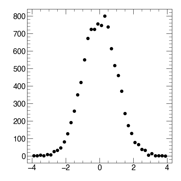
Simple example